- The ‘overflow’ property specifies whether to clip/cut the content or to add scrollbars when the content of an element (like div) is too big and does not fit inside the element area.
- Let’s say we have the following html code:
<html>
<head>
<style>
</style>
</head>
<body>
<h2>CSS overflow</h2>
<div>You can use the overflow property when you want to have
better control of the layout. The overflow property specifies what
happens if content overflows an element’s box.</div>
</body>
</html>
- Let’s apply the overflow property with the below values one by one and see the output:
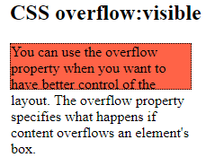
- visible: It means show the content even if it goes outside the element area. This is default. Below is the style to apply:
<style>
div {
background-color: tomato;
width: 200px;
height: 50px;
border: 1px dotted black;
overflow: visible;
}
</style>
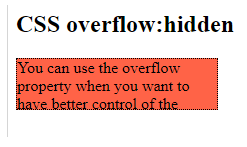
2. hidden: The outside content will be hidden or invisible. Below is the style to apply:
<style>
div {
background-color: tomato;
width: 200px;
height: 50px;
border: 1px dotted black;
overflow: hidden;
}
</style>
3. scroll: Scrossbars (both horizontal and vertical) will be added so that the user can scroll the element to view the invisible content which is clipped inside the element. Both the scrollbars will always be added. Below is the style to apply:
<style>
div {
background-color: tomato;
width: 200px;
height: 50px;
border: 1px dotted black;
overflow: scroll;
}
</style>

4. auto: same as ‘scroll’ value but it adds scroll only when it is necessary. Below is the style to apply:
<style>
div {
background-color: tomato;
width: 200px;
height: 50px;
border: 1px dotted black;
overflow: auto;
}
</style>

- The overflow-x property specifies what to do with left and right edges of the content.
- The overflow-y property specifies what to do with the top and bottom edges of the content.
- Below is the style to apply for overflow-x & overflow-y:
<style>
div {
background-color: tomato;
width: 200px;
height: 50px;
border: 1px dotted black;
overflow-x: hidden; /* hide the horizontal scroll*/
overflow-y: scroll; /*add the vertical scroll*/
}
</style>


 My Daily Notes